How the Sainsbury's Design Studio Packaged a Nation’s Dreams
The Invincibles of post-war supermarket design. Words by Ruby Tandoh.
Good morning and welcome to Vittles Season 6: Food and the Arts.
All contributors to Vittles are paid: the base rate this season is £600 for writers (or 40p per word for smaller contributions) and £300 for illustrators. This is all made possible through user donations. Vittles subscription costs £5/month or £45/year ─ if you’ve been enjoying the writing then please consider subscribing to keep it running and keep contributors paid. This will also give you access to the past two years of paywalled articles.
If you wish to receive the Monday newsletter for free weekly, or subscribe for £5 a month, please click below.
Today’s newsletter by Ruby Tandoh is the third in ‘The Story of Post-War Food Told Through Art’, a series of essays looking at how food changed in England after the Second World War, told through different artistic mediums — literature, painting, design — all offering alternate answers to why English food changed.
You can read the first newsletter on literature and the culinary imagination of Barbara Pym, H.E. Bates, Muriel Spark, Sam Sifton and Evelyn Waugh here.
The second newsletter on painting and the English food traditions and spaces depicted by Beryl Cook can be found here. JN
How the Sainsbury's Design Studio Packaged a Nation’s Dreams, by Ruby Tandoh
When Leonard Beaumont joined Sainsbury’s as a design consultant in 1950, what came first was the problem of the egg. Until this point, if you wanted to buy an egg, a Sainsbury’s worker would hand-pick it from a wicker basket behind the counter and place it in a small paper bag or, if you were lucky, a rudimentary carton. Since at least the reign of Queen Victoria, Britain (perhaps leaning into the ‘nation of shopkeepers’ taunt) had taken grocery shopping very seriously and, as is the case with almost all of our most serious national projects, this meant an earnest commitment to ceremony. Being a housewife was a full-time project and shopping was a daily, carefully choreographed, often arduous routine: from one shop counter to another, from the care of one sales assistant to the next, the fabric of a morning was a patchwork of little queues.
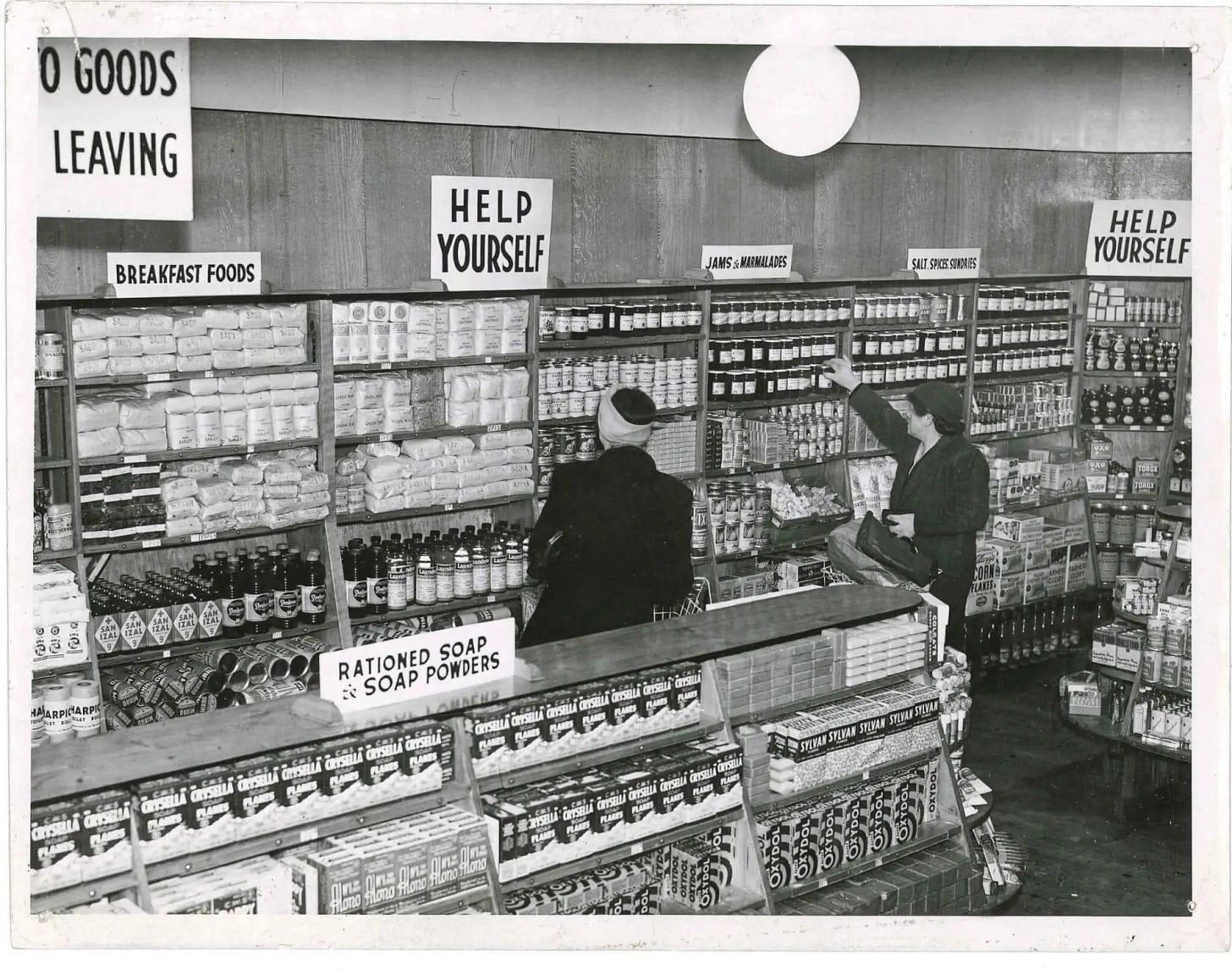
We do not, as a nation, respond to subtlety, and it would take the Second World War to precipitate a move away from counter service and towards a less theatrically deferential way of selling food. In 1949, the Ministry of Food – the wartime arm of government responsible for rationing and British restaurants – granted 80 self-service licences, incentivising existing shops to convert to a new ‘self-service’ shopping model that would free up labour in a workforce depleted by war. With the exception of deli, fish and butchery products, most food would be laid out in shelves on the shop floor where they could be touched, held and chosen by the customer. Sales counters all but disappeared, freeing up space for the easy drift of passengers through the store. Tills were moved to the very edge of the shop, delaying the imposition of the real world for as long as possible. Compared to the fragmented, mediated experience of counter service, this was an immersive and tactile way of shopping. Pick things up, put them down, look, look, look. Shopping became, as Rachel Bowlby puts it, ‘an endless “perhaps”’. Sainsbury’s converted its first branch in Croydon in 1950, and by the end of the decade one in ten of its stores were self-service. Perhaps supermarkets were bound to happen at some point, but it was the war – or more accurately, the negative spaces opened up by the war – that set the stage for the supermarket’s ascent. For an increasingly suburban British public, the supermarket turned into a repository for small dreams.
Leonard Beaumont’s problem was working out how to package these dreams. The egg box was an existing technology, but it was missing something – a carton from the 1930s simply read ‘J. Sainsbury’ and ‘Freshness Guaranteed’. Beaumont knew that it would no longer be enough to simply pack the eggs: now that the product was liberated from the care of the salesperson, they needed to be packaged. As Shelf Appeal journal explained in 1936, ‘packaging is really packing plus something else.’ It now had a double function: to safeguard but also to promote. With the shopping experience no longer mediated by a sales assistant, products had to sell themselves.
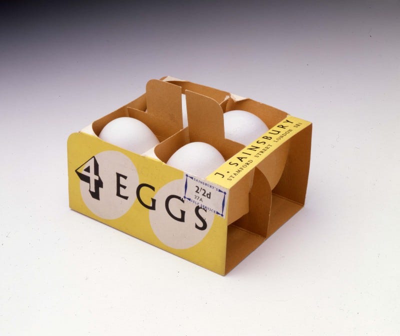
The egg box design overseen by Beaumont was a four-egg carton made from interlocking slips of card. Down one of its yolk yellow sides ‘4 EGGS’ was written, while ‘J. SAINSBURY STAMFORD STREET LONDON SE1’ was overlaid on top in vermillion Albertus typeface – a font that would become a brand signature for much of Beaumont’s tenure. Behind the labelling, two off-white ovoid shapes – no outlines, just egg-shaped negative space – were a starkly geometric touch, owing as much to the work of Bauhaus painter László Moholy-Nagy as to the 80 years of Sainsbury’s design that had come before.
The following year, Beaumont worked on the 1951 Festival of Britain – perhaps the most potent expression of Britain’s post-war ambition. The festival was a ‘moment of modernity’, with Britain’s culture reoriented to look towards the future; this seemed to mean hygiene, progress, science, and a new way of living brought to, and bought by, the masses. It’s impossible to disentangle this change of sensibility from the domestic migrations of those post-war years: self-service Sainsbury’s branches were built on London County Council estates in Debden and Grange Hill, serving Eastenders who’d relocated from the bombed inner city, as well as in the new towns of Harlow, Stevenage, Crawley and Hemel Hempstead. (When a new Sainsbury’s opened in East Grinstead, it was not sold as the best or the biggest or the most bountifully stocked but ‘the most modern’ supermarket in the country.)
Lord Alan Sainsbury (known to everyone as ‘Mr Alan’), who would become Beaumont’s employer, wanted to similarly rupture the sentimentality of Victorian packaging and the necessary drabness of wartime. One of his influences was the design work of Frank Pick, the man responsible for the modernist aesthetic of the London Underground. He worked with Beaumont to translate the national mood – a feeling, whether or not it was justified, of British common sense, practicality, robustness, quality and taste – into a visual register that would reflect the average consumer’s reality while conveying their dreams. ‘Simplify,’ he would stress. ‘Simplify.’
Over the next 14 years, Beaumont’s designs were rolled out across Sainsbury’s stock. Typefaces were standardised and designs streamlined; punchy labelling replaced lengthy assurances of quality or provenance. By 1960, there were 1,000 Sainsbury’s own-label products, all unified with a common visual language. As Mr Alan put it, ‘our design will have failed if our customers have to read the name over our entrance to know the shop they are entering.’ Every bottle, box and own-label tin had to be a physical expression of the idea and identity of Sainsbury’s.
Wherever a creative process is a group effort – when it stretches between people and across a number of years – one iteration of that team will always emerge as the line-up. For Sugababes (the Trigger’s broom of British girl groups), it was Mutya, Keisha and Heidi, from 2001 to 2006. Arsenal’s ‘Invincibles’ season of 2003–2004 would come to define the club for almost twenty years. Leonard Beaumont may have set the tone for the design of Sainsbury’s own-label products, but the company’s heyday started in 1962, with the arrival of Peter Dixon and the birth of the Sainsbury’s design studio.
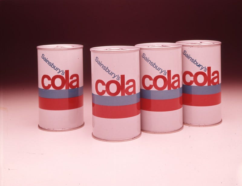
The hits came fast. Two fat horizontal stripes – the lower one in bright red, the upper in cerulean – wrap around the white belly of a cola can designed in 1966. Sat lightly on top of the blue stripe is the word ‘cola’ in red, lower-case Helvetica, its letters huddled so closely together that they touch, turning the word into a coherent form in its own right. Set at an angle, the ‘Sainsbury’s’ descends towards the ‘cola’ like a straw. A 1971 packet has ‘trifle sponge cakes’ in ultra-bold white Helvetica against a backdrop of contrasting, but tonally similar, bands of red-orange and magenta. The wide, uneven plains of colour interplay without blending, a kind of own-label Rothko.
One particularly iconic design is Bill Wilson’s 1970 cornflakes box. Beneath the ‘corn flakes’ – which is huge, in slim, angular lettering – are thirty-five golden circles, arranged into a neat grid pattern. The abstraction of this particular design is almost total: it is similar to Agnes Martin’s 1959 work Buds. In many of these designs, flat, block colours dominate, a shock against a background of white: a set of 1967 jam labels look like Pantone colour swatches. This visual simplicity aimed to convey a kind of modern functionality that had been lacking until that point.
Dixon’s mission as head of the design studio was to create packaging that was ‘flexible and progressive,’ and he ensured there was room for a diversity of styles. (By 1985, Dixon’s team included seven designers and three administrative staff.) Unlike Beaumont’s favoured Albertus, the typefaces used in the design studio’s creations range from modernist Helvetica to blocky, utilitarian Venus and the baroque serif stylings of 1970s frozen burger patty and Scotch egg packages. Some designs featured blown-up, almost abstracted photography. Others, like a wheat flakes cereal packet, drew on a vernacular style, illustrated wheat sheaves calling to mind the English pastoral myth.
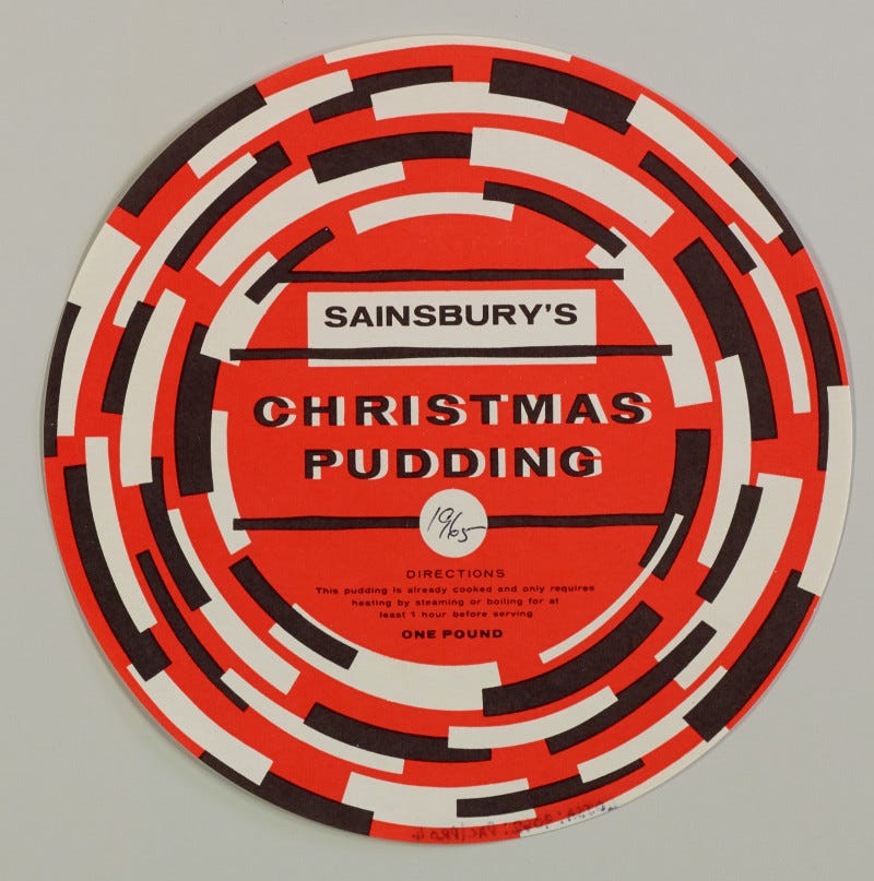
A 1965 design for a two-pound Christmas pudding is reminiscent of the work of the Russian constructivists: in squat sans serif and fully capitalised lettering, the words ‘SAINSBURY’S’ and ‘CHRISTMAS PUDDING’ bellow out from the centre of the circular design. The colour scheme is pared back, nearly monochromatic, with white and almost-black rectangular-ish forms orbiting against a field of red. There’s a whisper of the emerging sixties psychedelia in this vortex, but really it has more in common with constructivist El Lissitzky’s geometric designs, suffused with expressive, unstable dynamism.
The results of the design team’s efforts were often startlingly different, but what animated each one was a desire for the packaging to reflect the quality of the product it contained. As Design magazine put it in 1967, this was ‘designer’s design’, very different to the packaging of rival chain Tesco, which they witheringly described as ‘an approach that suggests that the average housewife has relatively unsophisticated requirements’. The Sainsbury’s aesthetic was harmonised company-wide, with the studio even creating in-house educational materials and training manuals that would never realistically reach the public. It was a unified theory of Sainsbury’s, constructed through attentive, sometimes exuberant design. This synthesis of art and pragmatism chimes with El Lissitzky’s vision of ‘das zielbewußte Schaffen’ – creation that is also purposive, or art that serves a goal. ‘In the end it doesn’t matter much if the consumers appreciate what we are doing,’ Dixon shared in one interview, ‘so long as they keep buying what we are doing.’
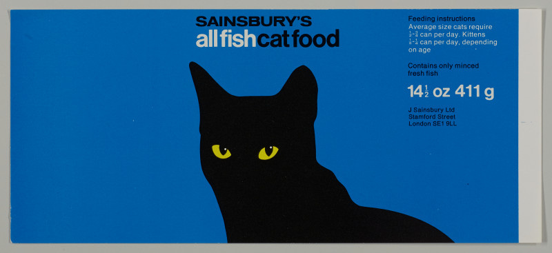
After Peter Dixon retired in 1989, the studio was slowly wound down and nearly all design work contracted out to agencies, but if you’ve spent any significant amount of time online, you have probably encountered its work, perhaps retweeted onto your feed or shared in nostalgia-complex Facebook groups. This afterglow is at least in part thanks to the Sainsbury Archive at the Museum of London Docklands: a temple for 150 years of commercial design, where archivist Allison Foster presides over a collection of packaging that ranges from empty packets of crisps from the mid-1970s (angular striations of electric blue and yellow; a clear plastic window) to designs for cat food. She often summons these objects from the archival depths, taking to Twitter to share that cola can or cardboard packaging for five ounces of Brussels sprouts.
Seeing these designs today, it’s hard to avoid a sense of loss. There’s an argument to be made that they are as expressive of post-war Britain as Guimard’s curlicued Métro stations were of Belle Époque Paris, although, unlike the stylings of art nouveau, these packages register as strikingly modern, even today. Many of them are beautiful, and those that aren’t beautiful are ugly, which at least means they are interesting. The alleged drabness of the food of the 1970s and 80s doesn’t tally with the arresting design work being done at the time, just as the dullness of design today doesn’t reflect the diversity of cuisines and ways of cooking that we now have access to in the UK. With the move to agency-led design work has come a blurring of identities between different stores and over time: I’m not sure that it’s true any more that you could, as Mr Alan dreamed, know that you’re in a Sainsbury’s without having to read the sign over the door.


Still, nostalgia – even, or especially, for a time that is not our own – has a way of pulling history out of shape. When I romanticise these designs from the 1960s and 70s, I remind myself of Twitter accounts that share a photo of Rococo sculptor Giuseppe Sanmartino’s Veiled Christ alongside Duchamp’s urinal and lament the decline of Western art. Wandering the aisles of a Sainsbury’s now, you don’t feel like you are navigating the architecture of war or embracing modernity, but languishing in a place outside of time in perfect, frictionless ease. (Ease, it bears saying, is not the same as simplicity.) But maybe this new aesthetic, which is more cluttered and less engaging, designed to promise but never to provoke, is true to the kind of shopping we do today. If we were to revive those designs from the 1960s and 70s, no matter how modern they appear, we would be lying about who we are. In the 1950s, Leonard Beaumont was lying too, in a sense (Britain would not really be ready for the supermarket for a few more years), but it was at least a generative lie – pretending that the British supermarket was something that it wasn’t yet, but could be, if all went according to plan.
Sainsbury’s packaging in the post-war years was striking because it had to be: because the supermarket was still establishing its place in British domestic life; because self-service was new; because hygiene needed to be seen to be improving. These designs ‘[brought] order from the chaos,’ as Beaumont put it, packaging not just their physical contents but also the idea of the supermarket more generally. Today, for better or worse, supermarkets are a given – purgatorial, vast, unassailable – and packaging has nothing left to sell but the food.
Credits
Ruby Tandoh is a writer on food and culture whose work has appeared in The New Yorker, The Guardian, Vice, Taste, Eater, Vittles and more.
Vittles is edited by Jonathan Nunn, Rebecca May Johnson, and Sharanya Deepak, and proofed and subedited by Sophie Whitehead.







Jonny Trunk's book 'Own Label' is a wonderful visual reference of the work of the Sainsbury's Design Studio - and a bottomless pit of inspiration for designers with an appreciation for a certain type of economic minimalism. Its interesting how the aesthetics of aspiration have changed over time, and sad that the time that the Design Studio's work was ahead of ended up on alternate timeline to our own. Thank you, Ruby - love to see them in the context of european modernism, and love to see a Sugababes reference.
What a great article. Thank you so much Ruby and Vittles. I remember the old counter Sainsbury’s as a child visiting grandparents in Folkestone in the 1950s and grew up with the growing role of supermarkets and their increasing scale. But this is the first time I’ve read about how the design of packaging developed alongside. Must visit the museum!